Why badge buddy design matters for fast role recognition
In a busy workplace, people rarely have time to “read” an ID—they scan it. Good badge buddy design makes the role the easiest thing to recognize at a distance and while people are moving. That matters in any environment where handoffs, questions, or safety decisions depend on quickly finding the right person.
The simplest goal is also the hardest to execute: the role label should visually dominate the badge stack. If the role competes with names, credentials, logos, or access elements, the brain has to search—and searching causes hesitation, miscommunication, and unnecessary interruptions.
Design for the real moment of use: a quick glance from several feet away, in mixed lighting, with people walking and badges partially covered by lanyards, clips, or jackets.
- Fast recognition: people should spot the role in about a second
- Low confusion: roles shouldn’t look similar when glanced at quickly
- Consistency: everyone learns where to look and what each color/label means
- Durability in real wear: the layout still works when badges tilt, flip, or get scuffed
Information hierarchy: Role first, everything else second
Start by deciding what matters most in a fast scan. For role-based identification, the role/function is the single most critical attribute. Everything else—department, name, credentials, logos, access features—supports the role but should not compete with it.
A strong hierarchy reduces mental effort. When the role always appears in the same place and at the largest size, teammates don’t have to hunt for it. That makes everyday coordination smoother and can support safer communication habits in high-stakes environments, where clarity and standardized team practices help reduce errors and improve coordination (source).
- Level 1 (dominant): Role (e.g., NURSE, PHYSICIAN, SECURITY, VISITOR)
- Level 2 (optional): Department or role group (e.g., ICU, Imaging) if it adds clarity
- Level 3 (secondary): Name and credentials (best left to the main ID badge)
- Level 4 (quiet): Logos, barcodes, chips, access marks—present but visually minimized
If someone must read the name to understand the role, the hierarchy is backwards. A clear role badge makes the role obvious without requiring any other line.
Typography rules for a clear role badge (size, weight, and wording)
Typography does most of the work in role recognition. Your role label is essentially a sign—so treat it like one: big, bold, and simple. A clear role badge typically uses a single sans-serif font family to keep letterforms consistent and easy to parse at speed.
Instead of mixing multiple fonts, build emphasis with size and weight. The role line should be the largest text on the entire stack. Secondary lines (if you use them at all) should be meaningfully smaller and lighter so they don’t “argue” with the role.
- Use one clean sans-serif font family across the system
- Make the role text very large and bold; keep everything else smaller and calmer
- Prefer short, familiar words (NURSE vs. REGISTERED NURSE ON DUTY)
- Avoid long phrases and stacked modifiers that slow scanning
- Use ALL CAPS sparingly—best reserved for the primary role line
- If abbreviations are needed, consider pairing an abbreviation with a full label when space allows (e.g., RN above NURSE), but keep the primary role unmistakable
Only if your audience reliably recognizes them at a glance. Many teams do better using plain-language roles (NURSE, PHYSICIAN) on the buddy, while credentials remain on the ID card for closer reading.
Bold plus high contrast is usually enough. Outlines, shadows, and decorative effects can reduce clarity—especially at a distance—by making letter shapes harder to read.

Spacing and layout: predictable placement that reads in seconds
Once your hierarchy and type are set, layout should become predictable. Predictability is what makes scanning fast: people learn where the role appears and stop wasting time looking for it. Many teams place the role centered on the lower portion of the buddy or let it occupy most of the buddy’s height.
Spacing is not wasted space. Margins and separation keep the role from visually merging with other elements. If the role touches edges, sits too close to a logo, or shares a tight line with secondary text, it looks smaller and harder to parse—even if the font size technically hasn’t changed.
- Use a fixed role position (same place on every buddy) so eyes know where to land
- Leave generous margins; don’t crowd the edges
- Isolate the role line—avoid adjacent text that visually blends into it
- Use simple blocks: one strong role area, minimal secondary lines
- Keep alignment consistent (centered role is common; if left-aligned, keep it left-aligned everywhere)
If your layout only looks good when you hold it still and close, it won’t work in motion. A fast-scanning layout still reads when the badge tilts or bounces.
Color coding and redundancy: help everyone recognize roles quickly
Color is powerful, but only when it’s used as a system. Assign colors categorically (one role group per color) rather than decoratively. A small palette reduces cognitive load: people can learn it quickly, and new staff don’t have to guess what a shade “means.”
Color should never be the only cue. For accessibility—including color-blindness and low-light conditions—pair color with a text label (always) and, if needed, a simple icon system that’s consistent across the set. Redundant cues help when a badge is partially obscured or when lighting makes colors look different than expected.
- Keep the palette small and intentionally assigned
- Aim for high contrast (white-on-dark or black-on-light) so role text stays readable
- Use redundancy: color + role text + optional simple icon
- Avoid “near colors” that look similar at speed (e.g., two dark blues for different roles)
- Test in real lighting and from real distances, not just on a screen
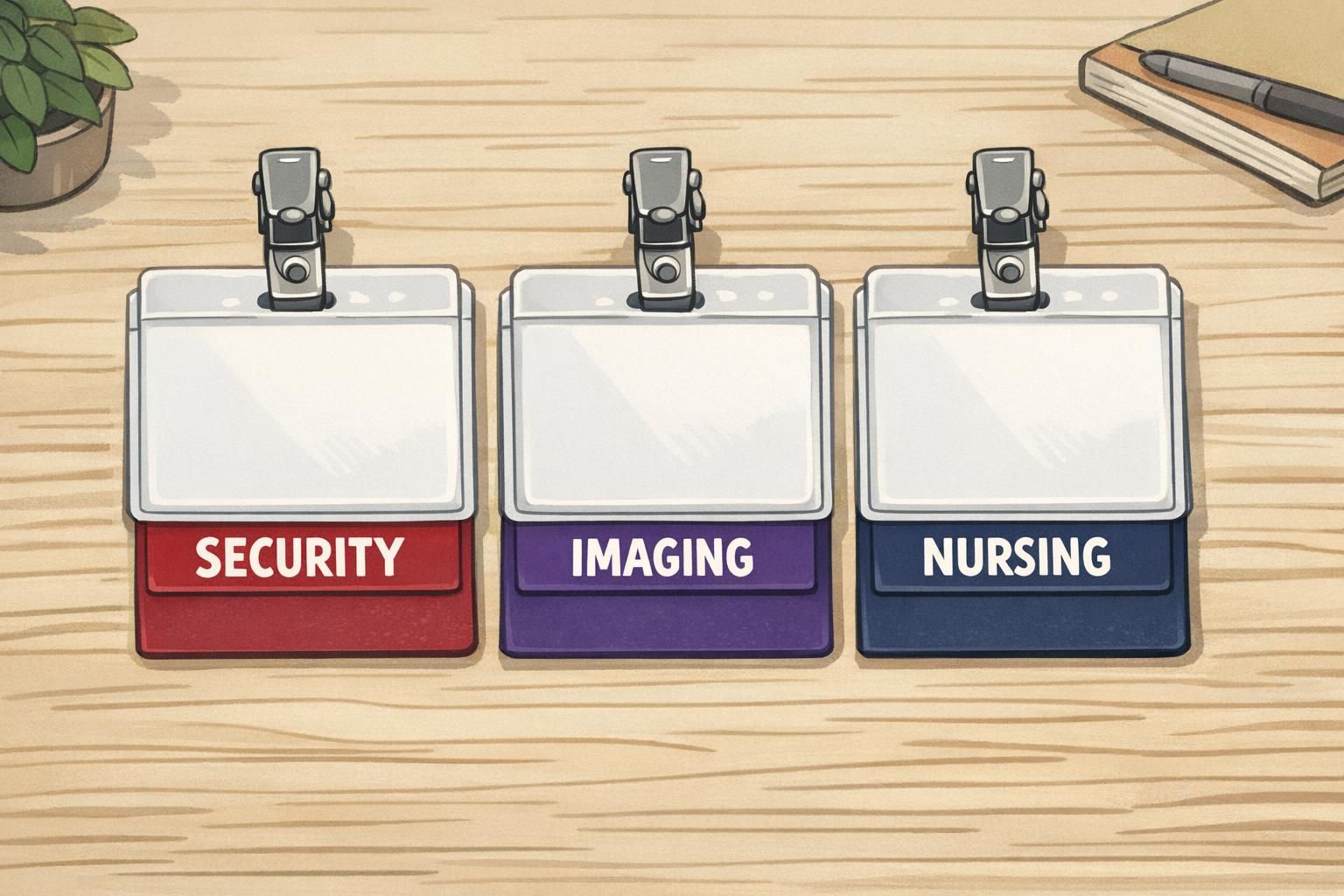
Role identifier system rules: standardize across teams and locations
A role identifier works best when it behaves like a “language” everyone shares. That means the same role always uses the same wording, casing, and color—across shifts, departments, and locations. When the system is stable, people trust what they see and act faster.
Standardization also prevents near-duplicates that look different in print but feel the same in a quick glance. For example, “NURSE,” “NURSING,” and “RN” might all be correct in context—but mixed together they slow scanning and invite uncertainty.
- Create a controlled role list and stick to it (e.g., NURSE, PHYSICIAN, SECURITY, VISITOR)
- Define casing rules (e.g., ALL CAPS for the role line)
- Define color rules (one role group per color, documented)
- Decide how to handle departments (when to include them, and how they appear)
- Add new roles intentionally: update the list and roll out consistently rather than “one-off” labels
"The biggest improvement wasn’t a new color—it was everyone using the same words in the same place. Once the team learned the pattern, role recognition became automatic." – Operations Coordinator
Physical wear and visibility: keep badges front-facing and unobstructed
Even a perfect layout can fail if it isn’t visible in real wear. Badges that hang too low, flip around, or tuck behind jackets won’t be scanned quickly. Design should match how people actually wear the stack: upper-torso placement is typically easier to see, and stable attachments reduce rotation.
If flipping is common, consider dual-sided printing so the role is visible from either side. Also keep access elements (barcodes, chips, logos) present but visually quiet so they don’t compete with the role label. The buddy’s job is role recognition; the ID card’s job is identity and access.
- Prefer stable attachments that reduce flipping and keep the stack aligned
- Design role text to remain readable when the badge tilts slightly
- Consider dual-sided role visibility if badges frequently flip
- Keep barcodes/logos visually secondary so they don’t pull attention away from the role

Putting it into practice with BadgeZoo: badge buddies and ID badge setups
Implementing a consistent system is easier when you standardize a few choices up front: buddy size, a small color set, and role typography. When every stack follows the same layout rules, people can scan quickly and trust what they’re seeing—even when they’re new to the site or moving between departments.
In practice, many teams use a badge buddy as the dedicated area for the large role label while the main ID badge holds the photo and name details. That separation helps keep the role visually dominant without cramming too much onto one card. If you’re exploring options, BadgeZoo’s badge buddies are designed to sit behind an ID badge in a single stack so the role can remain prominent while the ID card remains readable up close.
Before finalizing layouts, confirm how people wear IDs (clip, reel, or lanyard). The most readable design is the one that stays flat, visible, and consistent in day-to-day use.
Quick checklist: layout rules for fast scanning
Use this checklist to sanity-check any layout before rolling it out. If you can confirm these items with a quick visual test from several feet away, you’re on track for fast, low-confusion role recognition.
- Role is the largest text on the stack; it visually dominates
- One sans-serif font family; emphasis created by size and weight
- Wording is short, familiar, and consistent across the organization
- Role placement is fixed and predictable from badge to badge
- White space is protected; the role line is isolated from other text
- Colors are assigned categorically, using a small palette
- High contrast is maintained (text remains readable in mixed lighting)
- Redundancy is built in (color + role text, plus optional consistent icon)
- Barcodes/logos/access elements stay present but visually quiet
- A quick real-world test confirms readability while walking and at a distance
Making the role compete with other information. When names, titles, logos, and access elements are similar in size or contrast, people hesitate while they search.
Document your role naming and color rules, and only add new roles by updating the standard list. Consistency is what makes a role identifier system work.