Why Personalized Lanyards Matter in a Clear, Consistent Badge Program
Personalized lanyards can be a small change that delivers a big cultural payoff—without compromising the main job of a badge: fast, confident identification. In real workplaces and events, people verify credentials quickly and often at a distance, in motion, and under mixed lighting. That means the badge face must stay readable and unobstructed, even if the lanyard strap reflects personal style or team identity.
The balance is straightforward: keep the badge itself standardized for clarity, and allow tasteful personalization around it. When done well, customization supports engagement (people like having choices) and role recognition (teams can be subtly distinct) while still helping security, front desks, and colleagues confirm who someone is at a glance.
Practical boundary that protects clarity: never cover the name, photo, barcode/QR code, or expiration/credential details—whether with stickers, tape, frames, or accessories.
- Uniformity supports quick verification: name, face, and access cues are easy to spot
- Individuality supports adoption: staff are more likely to wear badges consistently
- Clear rules reduce awkward enforcement: everyone knows what’s allowed before issues arise
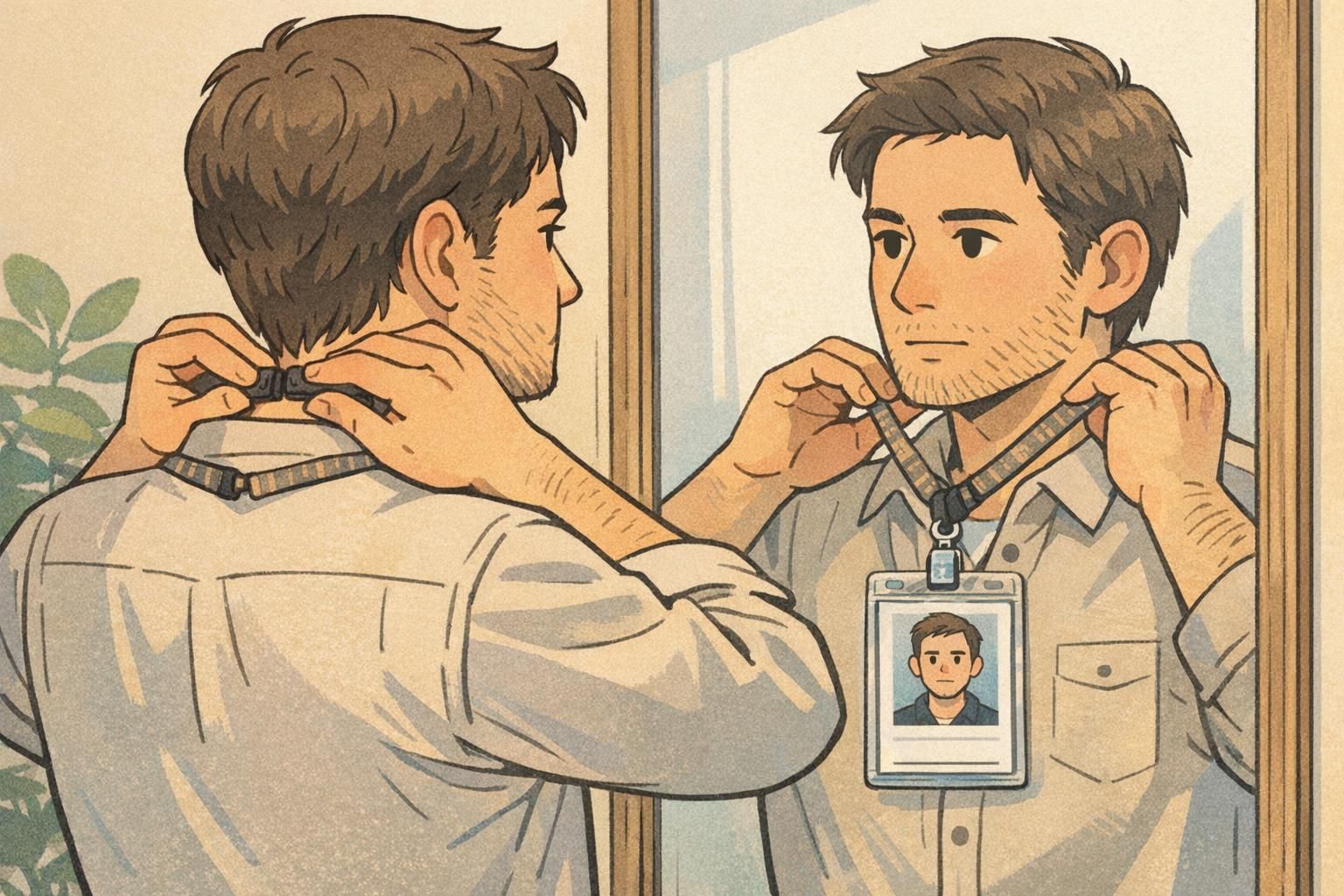
Define the Non-Negotiables: What Must Stay Standard on Every Badge
Start by defining what cannot vary. This is the “trust layer” of your identification program—the parts that let people confidently interpret badges across departments, sites, or event spaces. If different teams improvise layouts, font sizes, or where key fields appear, verification slows down and the system becomes easier to misunderstand.
A simple way to write this is to create a “must be visible at all times” list and apply it everywhere. Then add a small set of design standards (size, placement, contrast) to keep badges readable at a glance.
- Must be visible at all times: name, photo (if used), organization name, role/credential label (if used), and any scannable barcode/QR code or other access element used for entry
- Size standards: consistent card dimensions so holders and readers work as expected
- Placement standards: predictable location for the name line and photo area
- Contrast standards: dark text on a light background so it’s readable in typical indoor lighting
When your non-negotiables are clear, personalization becomes easier—not harder—because people know exactly what they must protect.
Badge Personalization Rules: Allow Minor Individuality Without Reducing Readability
Once the badge face is standardized, write badge personalization rules that allow limited choice without creating uncertainty. The goal is not to police style—it’s to prevent changes that hide identity fields or reduce the speed of recognition.
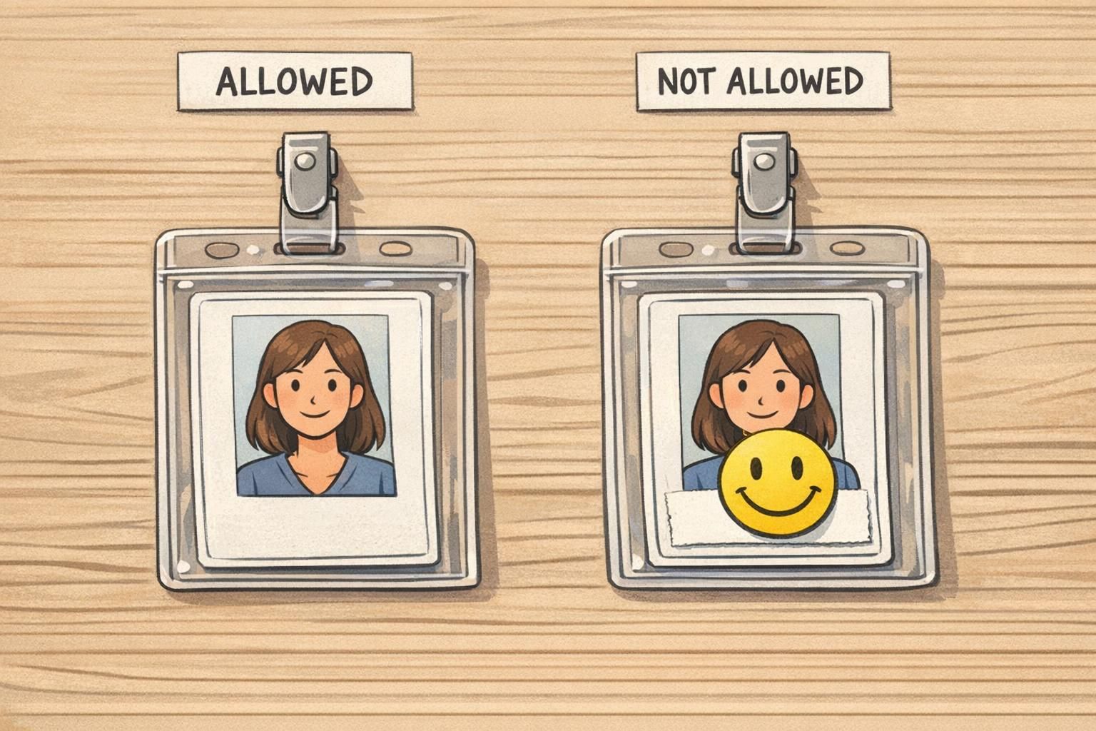
The most effective policies are short and visual. People follow what they can remember quickly, and managers enforce what they can explain in one sentence. A compact “Allowed / Not Allowed / Ask First” structure prevents inconsistent enforcement between supervisors, locations, or shifts.
- Allowed: lanyards chosen from an approved color palette or approved subtle patterns
- Allowed: small pins on the lanyard strap only (not on the badge face or inside the badge holder window)
- Allowed (if supported by your organization): optional pronouns on a designated badge line that does not replace the name line
- Not allowed: stickers, tape, or marker on the badge face that obscures name/photo/credential type/scannable code
- Not allowed: badge frames or holders that crop edges or cover corners where key information sits
- Ask first: unusual attachments, novelty lanyards, oversized clips, or add-ons that might cause flipping/rotation
"If we can’t read your name and verify your badge in one glance, we have to stop and ask questions. The easiest policy is: customize the strap, not the badge face." – Front desk supervisor
Company Branding: Keep the System Cohesive Across Teams and Locations
Company branding in badges is less about looking “marketing-perfect” and more about signaling legitimacy. When a badge system looks consistent, people trust it faster. That matters for visitors trying to find help, staff trying to verify access, and teams working across buildings or campuses.
If departments want their own look, build a controlled system rather than letting each team redesign the entire badge. Consistency in logo use, typography, and contrast helps everyone interpret badges quickly, while small standardized cues can still reflect internal structure.
- Keep logo placement consistent so badges look official at a glance
- Use a single type system (font choices and sizes) so names and roles stay readable
- Preserve strong contrast for key fields (especially name and role/credential labels)
- If you need department differentiation, use consistent colored headers, role bands, or small icons with the same size and placement rules
A cohesive look helps people quickly identify who can help them—and reduces the chance that an unusual badge design gets mistaken for an exception.
A Practical Policy Model: “Common Core + Flexible Options”
A reliable way to balance clarity and choice is the “common core + flexible options” model. The common core covers the fields and layout that make identification fast: what must be visible, where it lives on the badge, and what counts as compliant. Flexible options cover personal expression that doesn’t interfere with verification: approved lanyard designs, minor strap accessories, or role-specific backers that never block the badge face.
This approach works because it separates two different needs: the organization’s need for consistent categories and verification, and the individual’s desire for choice. Systems are easier to manage when categories are clearly defined and the rules for “what counts” are stated up front—an idea that also appears in research on structured badge/award systems, where consistent categories and criteria support clarity even when there are multiple paths to earning or displaying achievements (source).
- Common core (standard): badge size, name line placement, photo area, organization identifier, scannable code placement, minimum contrast requirements
- Flexible options (controlled): approved lanyard palette/patterns, approved attachment types, optional designated text lines (when applicable), standardized department cues (header color or icon system)
The best policies don’t force people to improvise. They offer multiple compliant choices so personalization stays within safe boundaries.
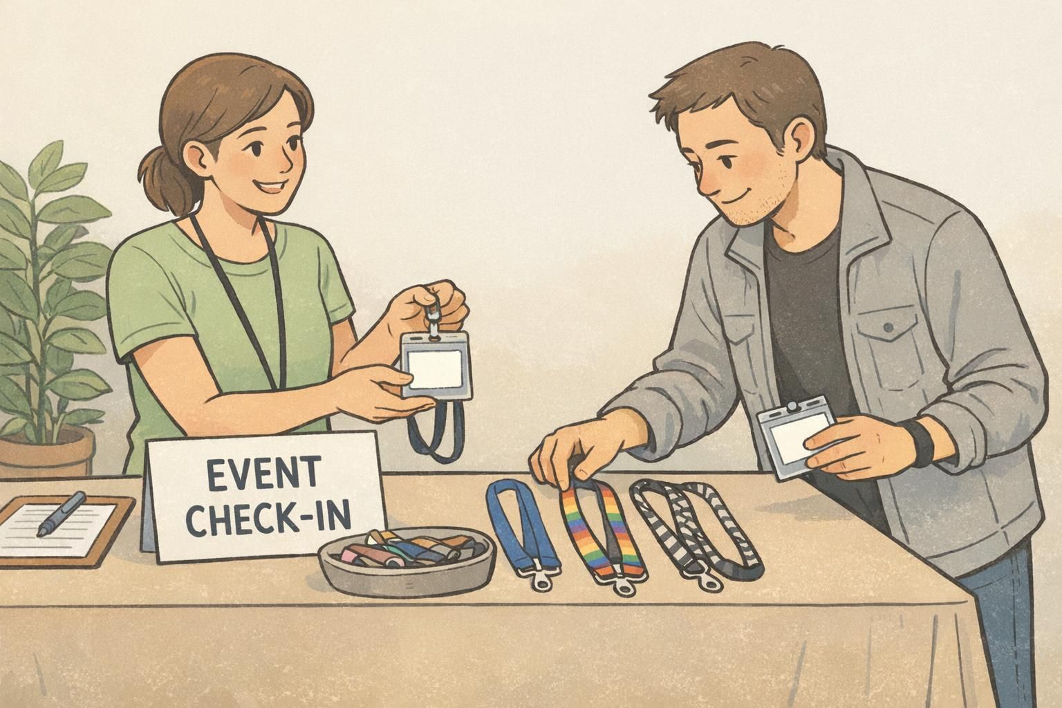
Lanyards, Holders, and Accessories: Safe Customization That Won’t Block Key Info
Most real-world badge problems aren’t caused by the badge design—they’re caused by what happens after printing. Holders can crop edges, lanyards can cause flipping, and accessories can cover key fields. Setting accessory standards early prevents a lot of day-to-day friction.
A good accessory rule is outcome-based: the badge face should stay front-facing during normal movement, and the identity fields should remain fully visible. Keep add-ons on the strap (where possible) and avoid anything that overlaps the badge window.
- Specify acceptable attachment types (for example, breakaway lanyards, reels, or clips) so badges hang predictably
- Require a clear holder that doesn’t crop the name/photo area or cover corners where important fields sit
- Keep decorative items on the lanyard strap, not on the badge or inside the holder window
- Ban oversized frames or holders that block edges or make the badge hard to scan
- Test at arm’s length in typical lighting to confirm names, photos, and codes can be verified quickly
It’s usually better to prohibit stickers on the badge face entirely. Even if the code scans, stickers can hide the name or make the badge look unofficial, and they often peel or discolor over time.
On the lanyard strap, not on the badge face or inside the clear holder window. That keeps the identity fields readable and avoids damage to the badge.
How to Implement and Enforce the Rules Without Friction
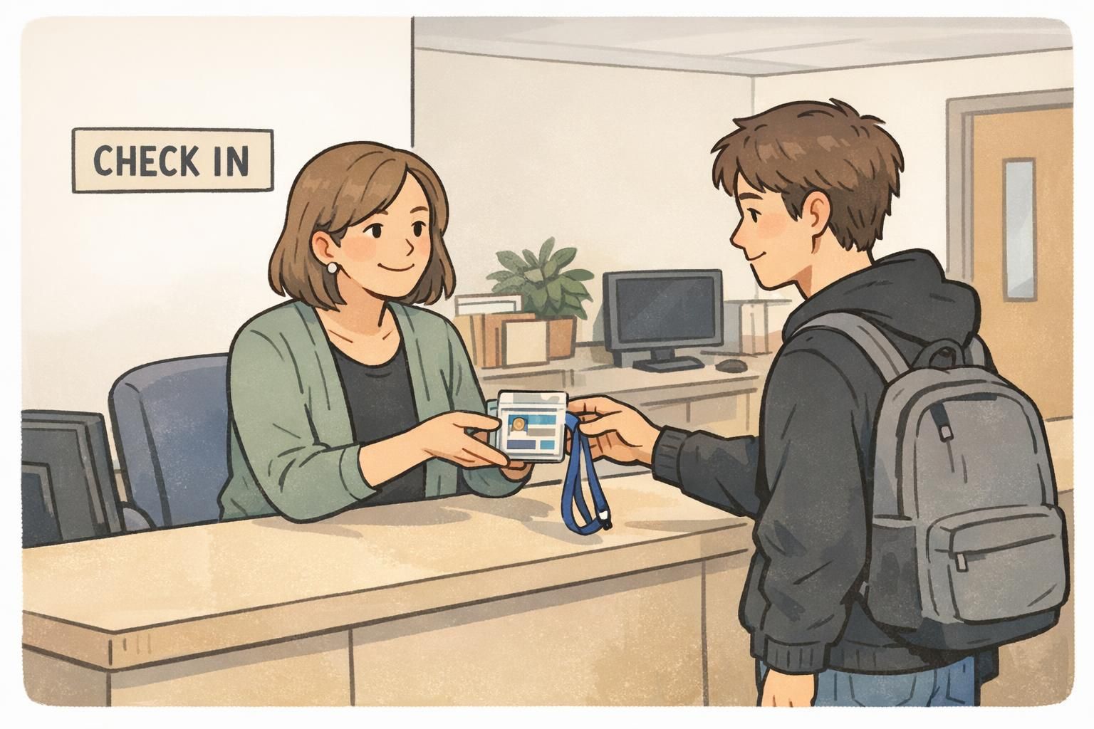
The fastest way to make a badge policy feel fair is to make it easy to follow. Roll it out with a one-page visual guide and align the people who will be asked to enforce it—front desk, security, supervisors, and event staff. When everyone checks for the same small set of non-negotiables, enforcement becomes consistent and calm.
Also plan for what happens when something is non-compliant: if replacements are easy to request, people are less likely to “make it work” with tape, marker, or a bulky frame that blocks key info.
- Publish a one-page visual guide with compliant and non-compliant examples
- Train check-in/security teams to look for name/photo/code visibility (and ignore minor lanyard variety within approved options)
- Create a simple “Ask First” approval path for edge cases
- Offer a straightforward replacement process for damaged or altered badges so fixes are quick and consistent

Choosing the Right Badge Materials for Clarity and Consistency (Product Fit)
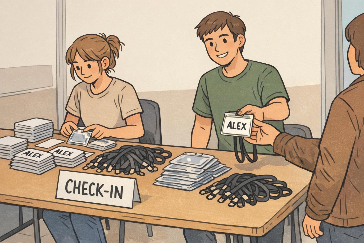
A clear policy works best when the physical badge and accessories support it. Durable printing and sturdy cards help names and photos remain readable over time, and compatible holders help prevent bending or edge-cropping that can make a badge look unofficial or become hard to verify.
If you’re refreshing templates or standardizing accessories, finalize the common core (layout, contrast, key field placement) first, then select lanyards and holders that keep the badge face front-facing. That sequencing makes personalization simpler because the “do not cover” zones are predictable.
If you need new cards for a standardized template, you can review custom plastic ID badges that support clean, consistent layouts for everyday workplace identification and events.
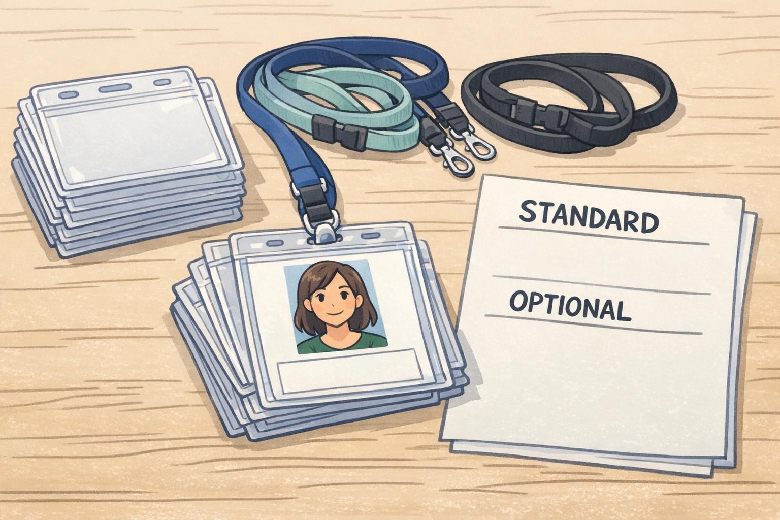
If you allow personalization, support it with the right hardware: clear holders that don’t crop key fields and attachments that keep the badge face forward.