Multi location ID Design: One Brand, Local Details That Stay Consistent
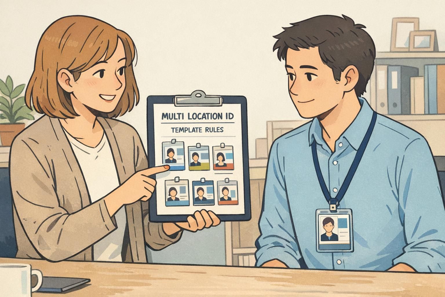
Why multi location ID design needs both consistency and local clarity A multi location ID program has two jobs at once: make your organization recognizable eve...
Why multi location ID design needs both consistency and local clarity A multi location ID program has two jobs at once: make your organization recognizable eve...
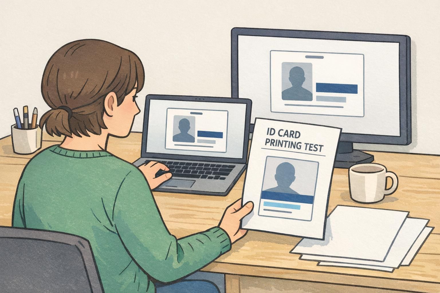
Why Screens and Printers Don’t Match (and Why It Matters for In-House IDs) ID card printing can be surprising the first time you compare a clean on-screen prev...

Why color coded badges work (and when they don’t) In busy workplaces, color coded badges can reduce friction in the small moments that matter: finding the righ...
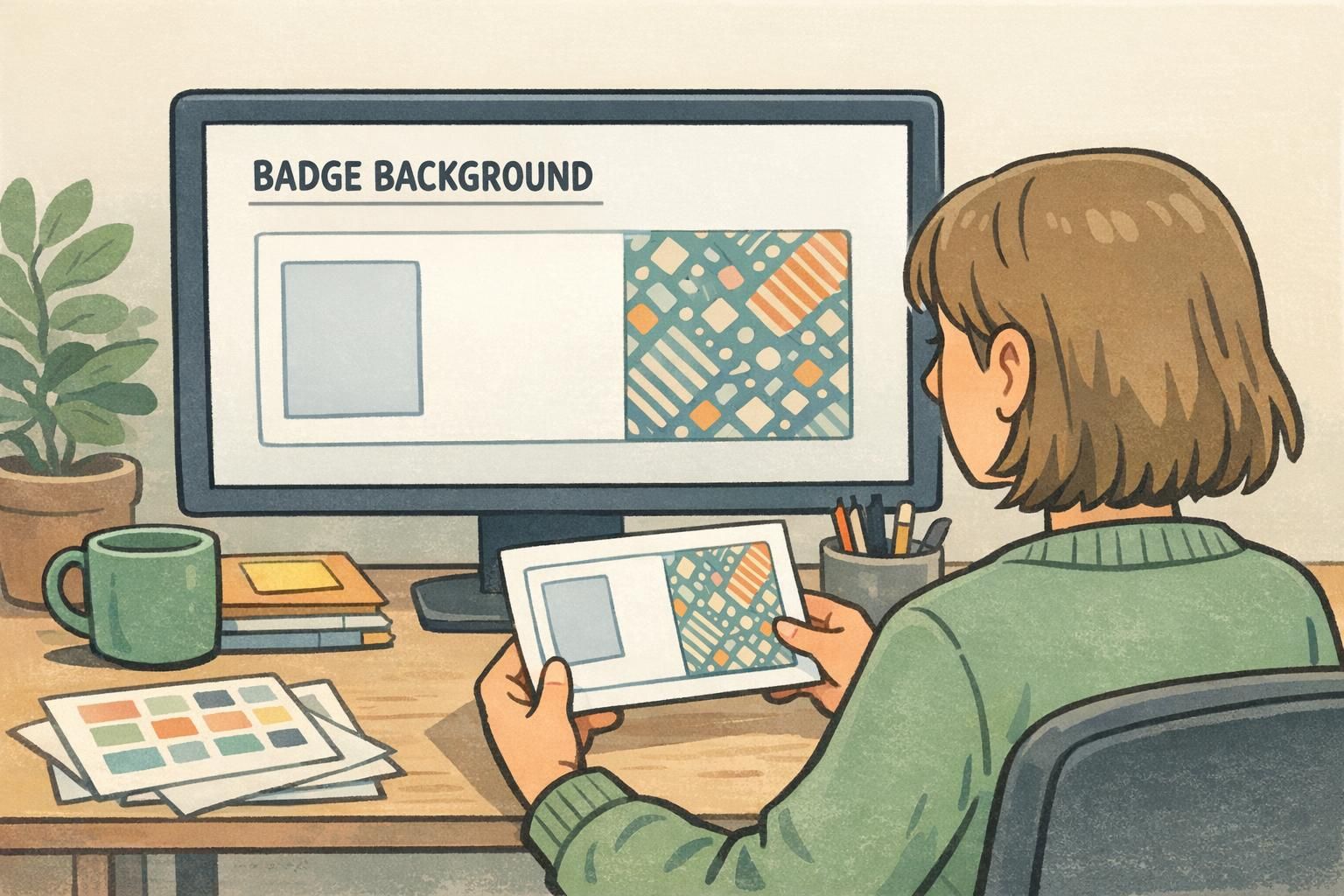
Why a Busy Badge Background Hurts Readability A badge is supposed to answer simple questions fast: Who is this? What’s their role? Are they allowed in this spa...
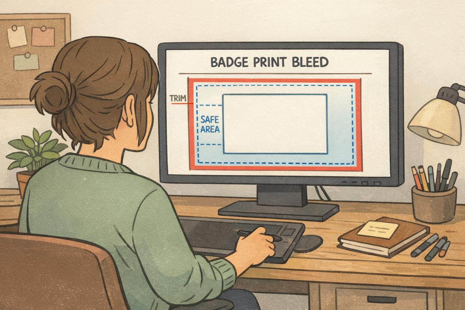
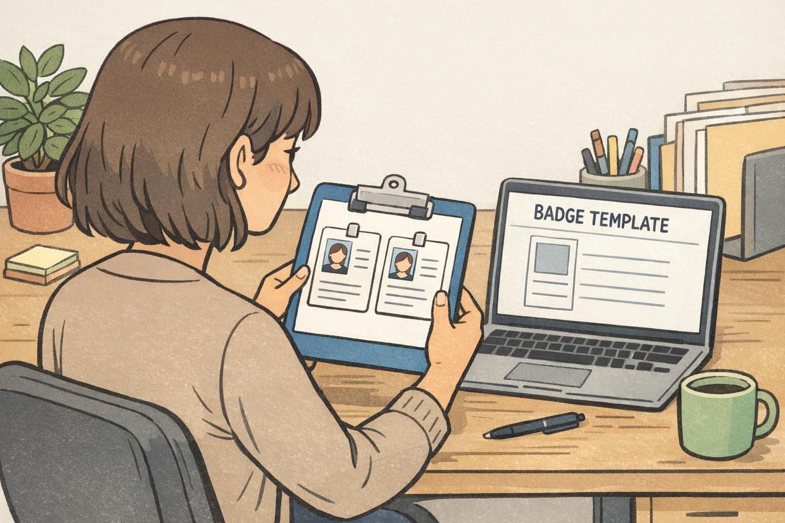
Why a badge template keeps every ID looking like one system A badge template is the easiest way to make identification feel intentional instead of improvised....
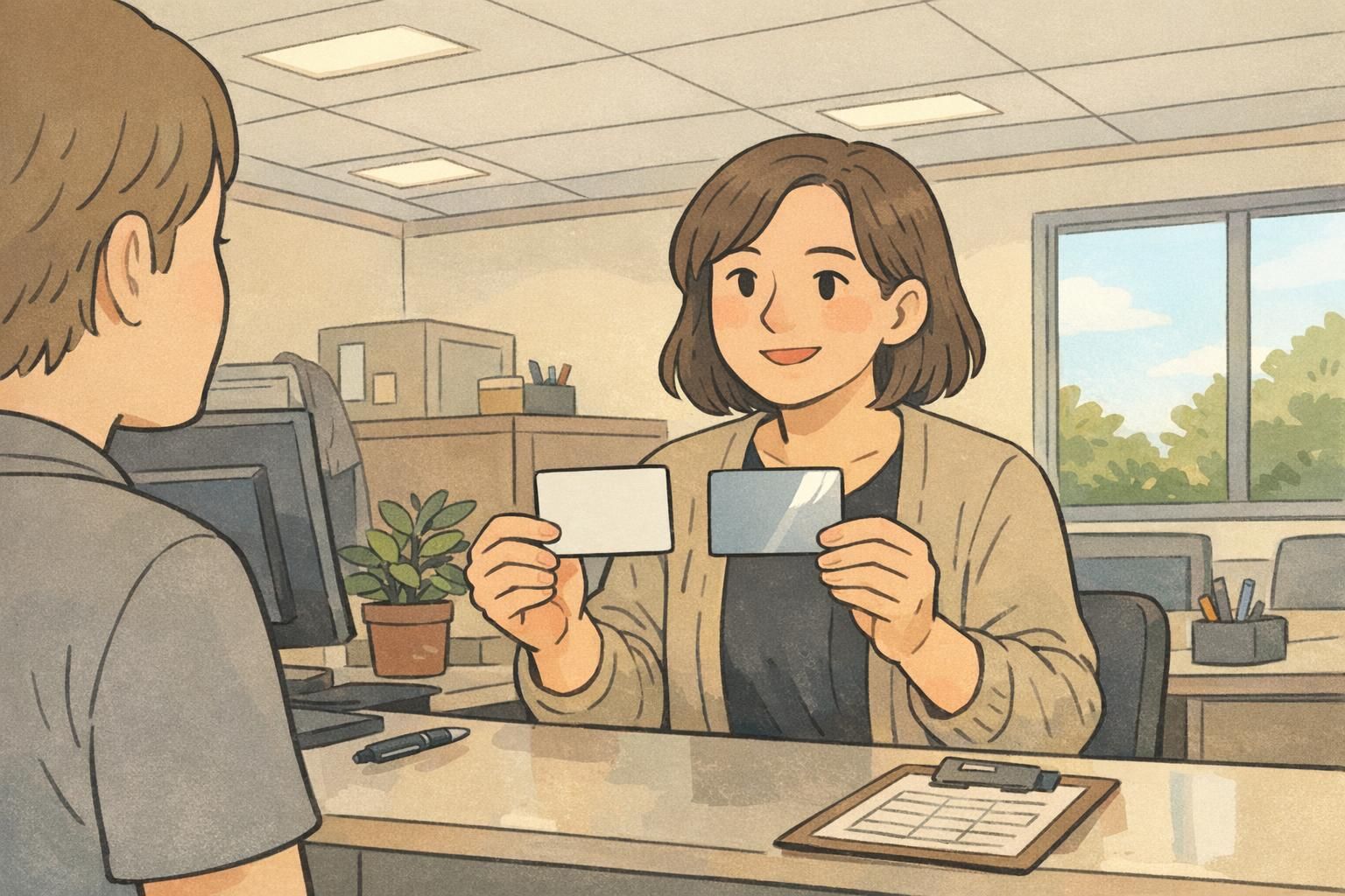
Why matte ID card finish matters under real-world lighting Most workplaces and events don’t have “perfect” lighting. You might have bright overhead LEDs, dayli...
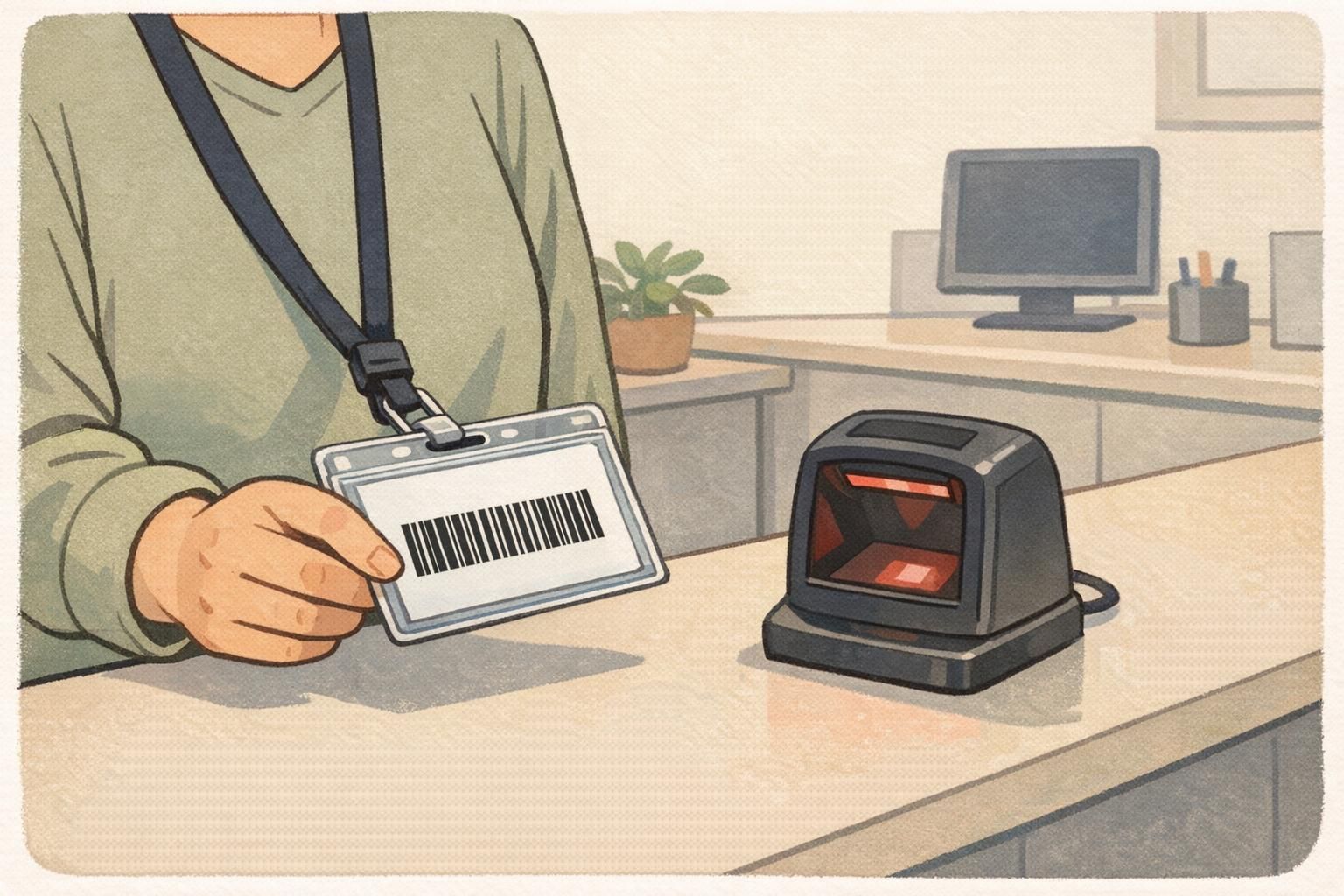
Why Barcode Durability Matters for Daily Badge Use A barcode ID card is only as dependable as the condition of the printed code. In real workplaces and events,...
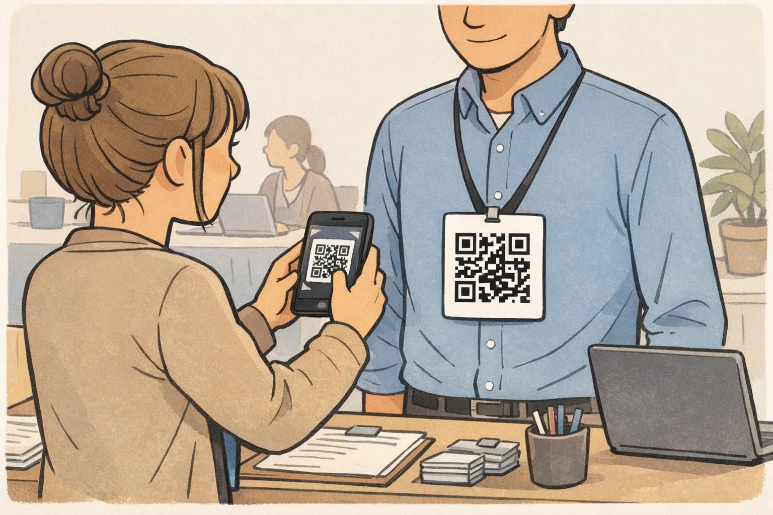
Why QR codes on badges fail (and how to prevent it) A QR code badge is only as useful as its first scan. If the camera hesitates, locks onto the wrong target,...
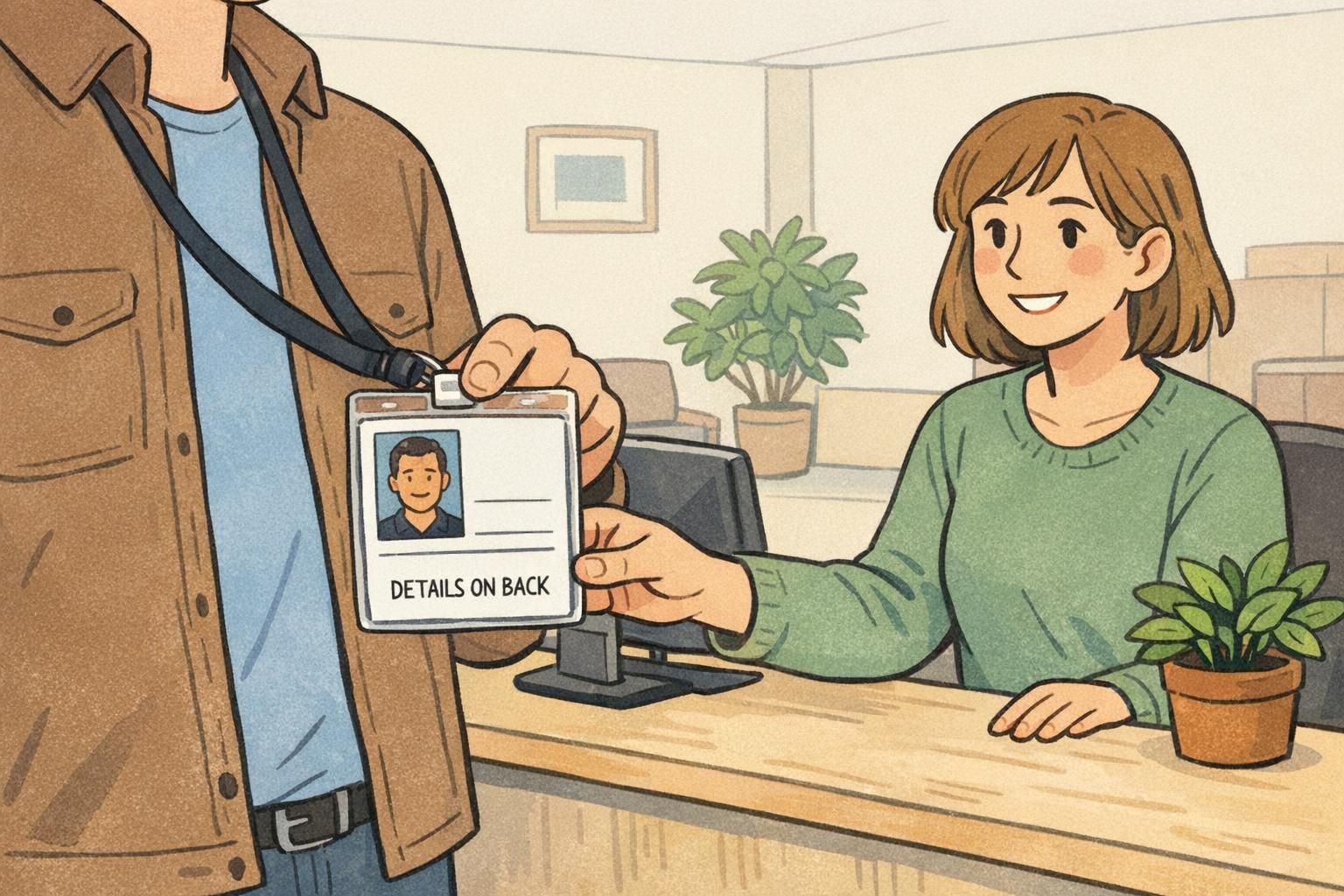
Why a double sided ID card needs a clear front/back plan A double sided ID card only feels “easy” when people instantly know what to look at—and when they don’...
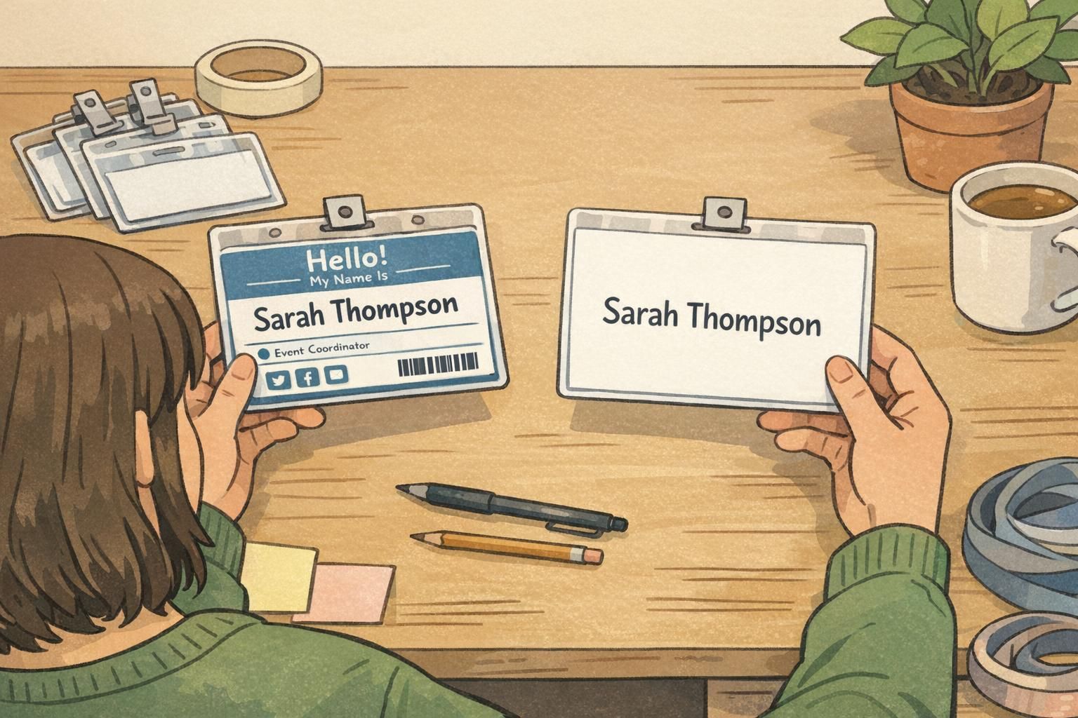
Why badge whitespace is the most underrated design tool Badge whitespace is one of the simplest ways to make a name tag or ID card easier to read in real life—...
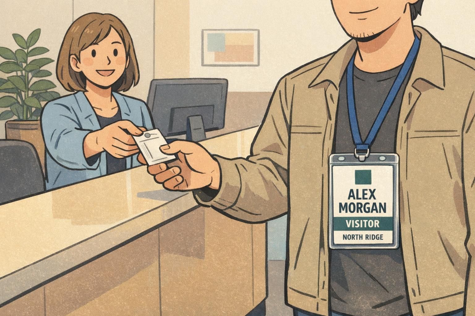
Why a Company Logo Badge Works Best When the Person Comes First A company logo badge succeeds when it helps people identify each other quickly and confidently—...