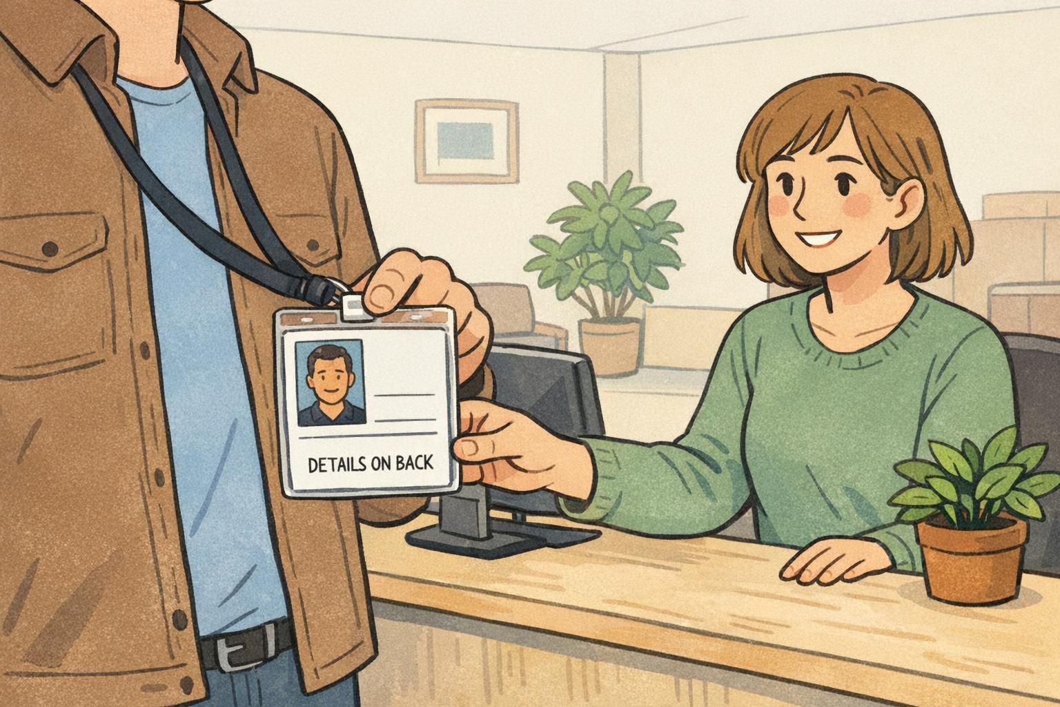
Double sided ID card Front vs Back Design: Split Badge Info Without Confusion
Why a double sided ID card needs a clear front/back plan A double sided ID card only feels “easy” when people instantly know what to look at—and when they don’...
Why a double sided ID card needs a clear front/back plan A double sided ID card only feels “easy” when people instantly know what to look at—and when they don’...
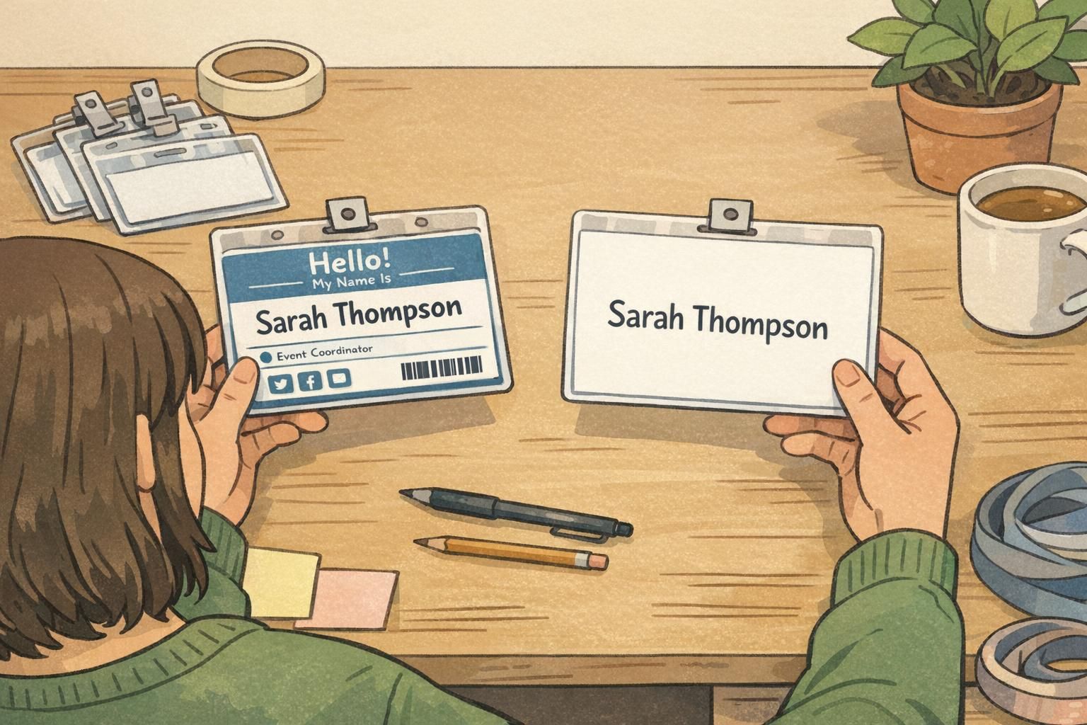
Why badge whitespace is the most underrated design tool Badge whitespace is one of the simplest ways to make a name tag or ID card easier to read in real life—...
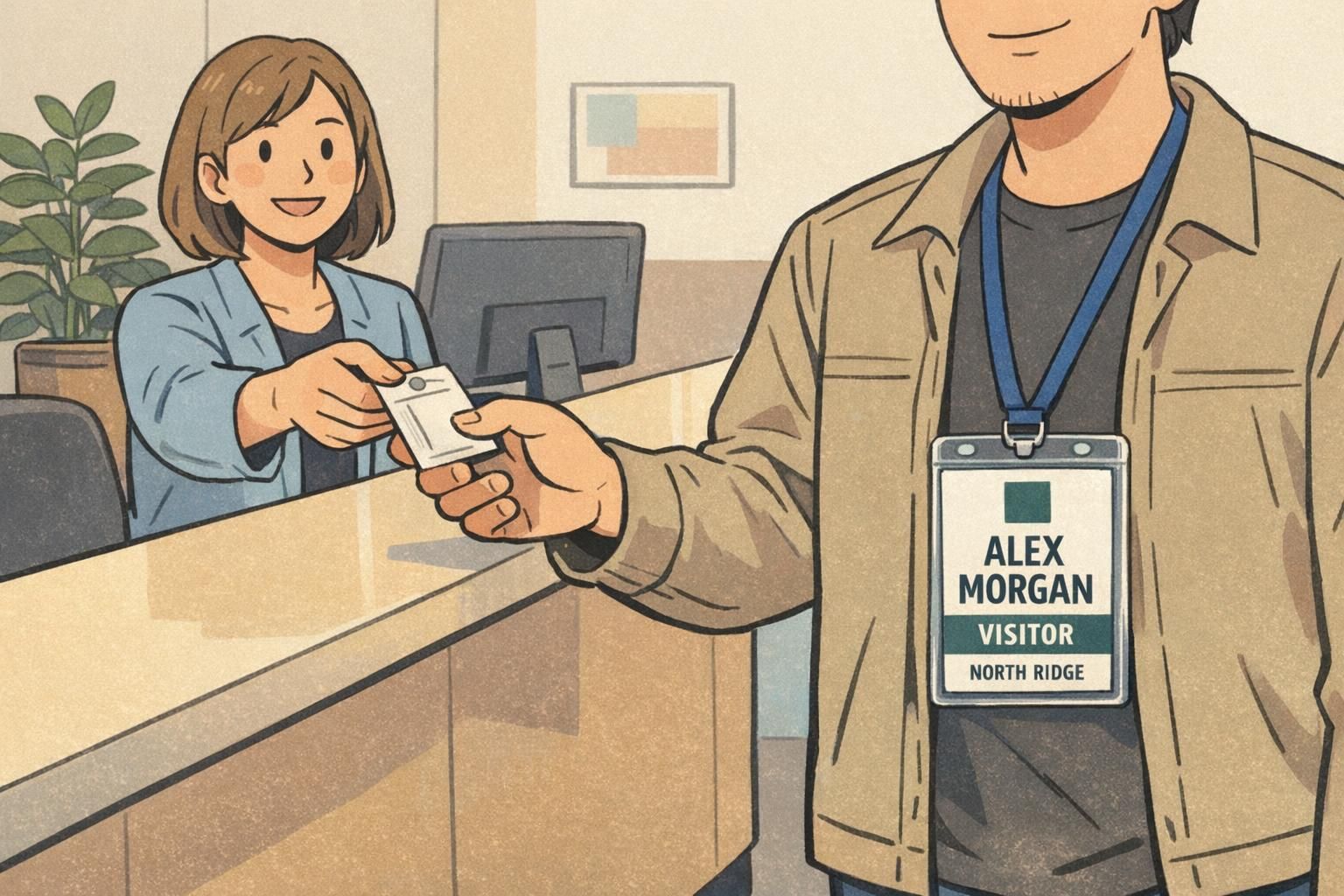
Why a Company Logo Badge Works Best When the Person Comes First A company logo badge succeeds when it helps people identify each other quickly and confidently—...
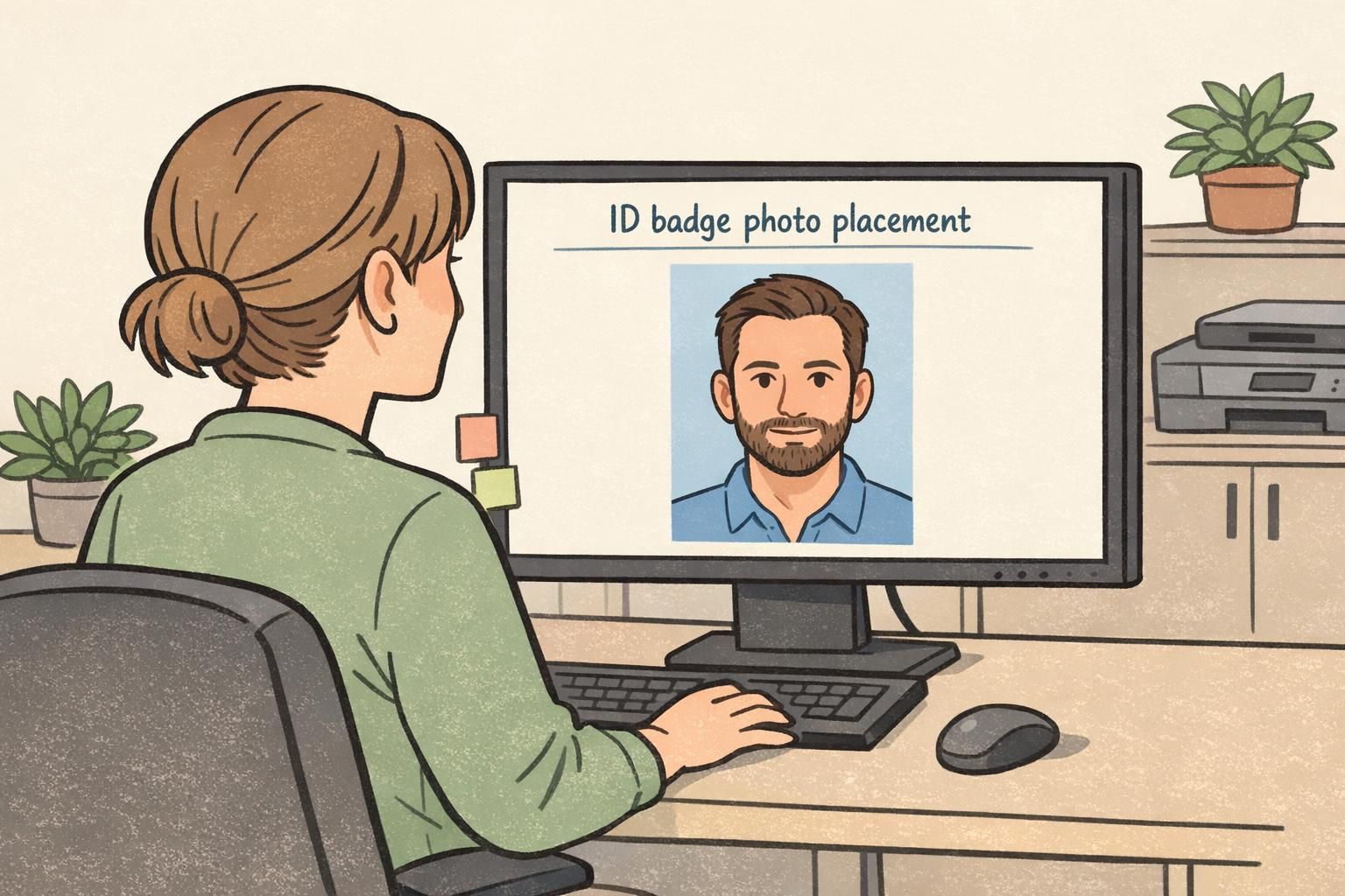
Why ID Badge Photo Placement Matters for Fast Recognition An ID badge photo does a job that text can’t always do quickly: it lets people recognize the wearer a...
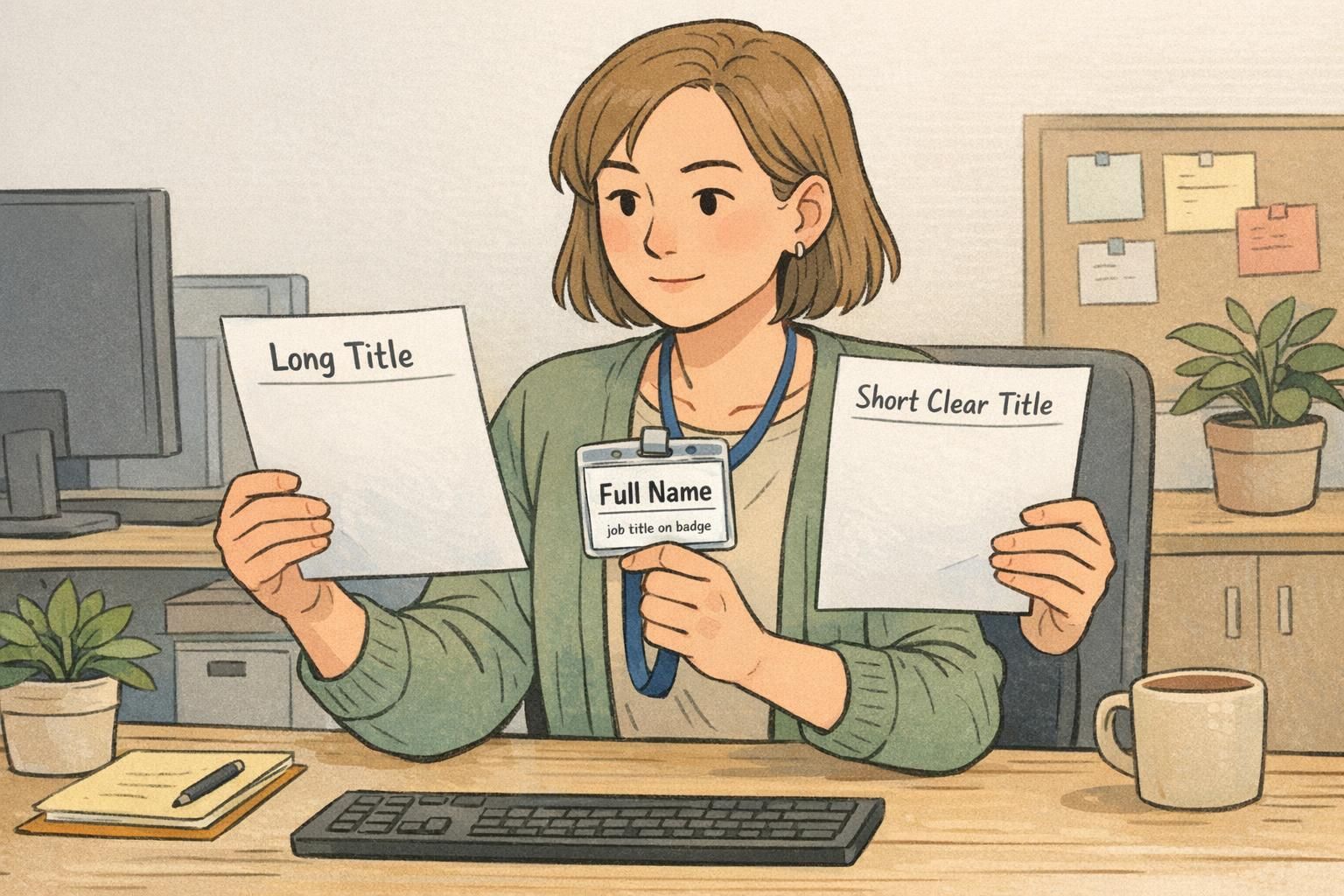
Why long titles get tricky on small credentials A job title on badge has to do a surprisingly hard job: communicate someone’s role instantly, on a tiny print a...

Why vertical ID badge vs. landscape is more than a design preference Choosing a vertical ID badge or a landscape layout isn’t just about what looks nicer on a...
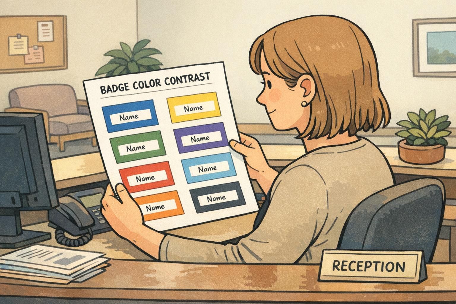
Why badge color contrast matters in real-world badge viewing Badge color contrast is the foundation of a badge that works in the real world—not just on a scree...
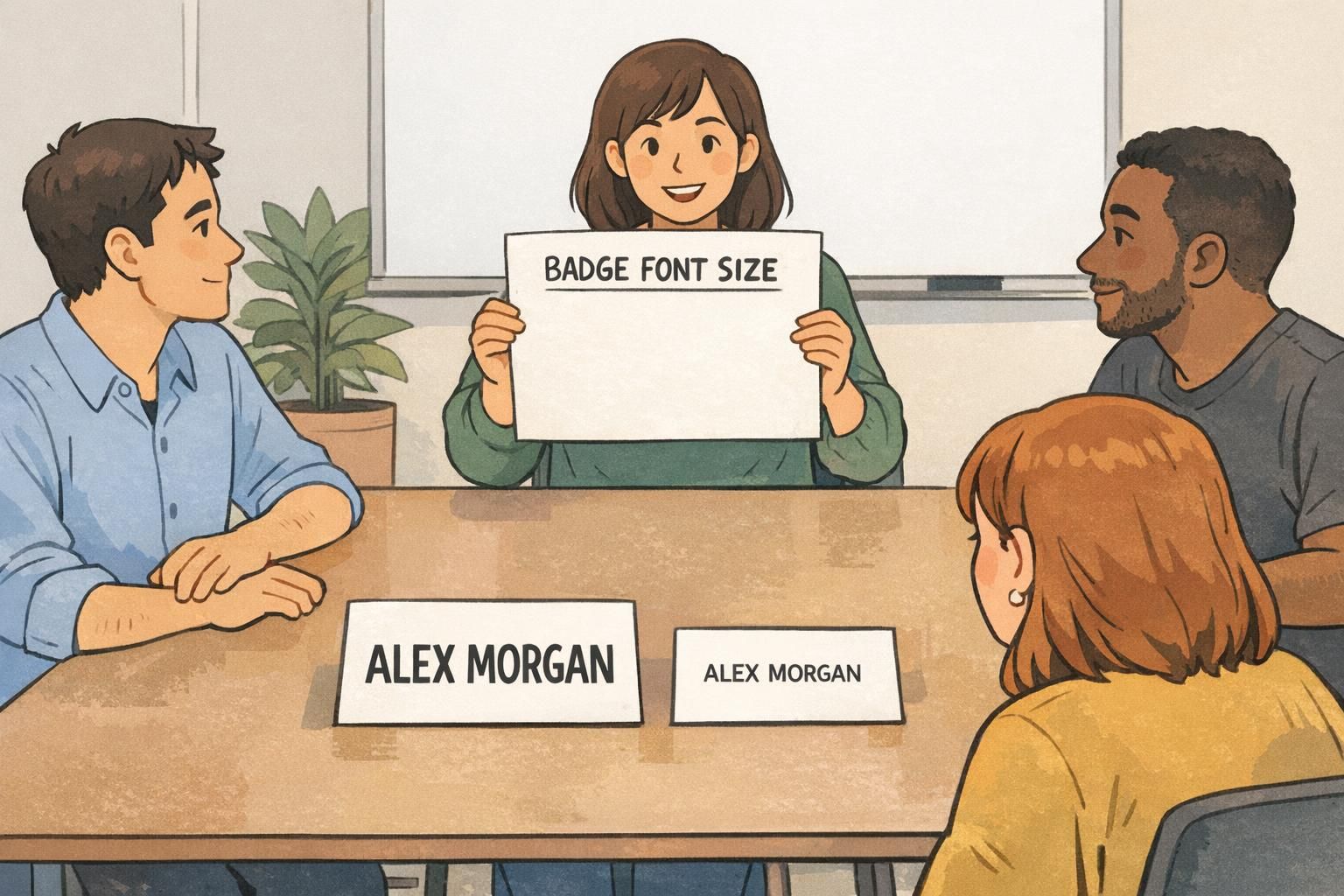
Why badge font size matters at 6 feet (and what “readable” really means) Badge font size is one of those details that feels “small” until you’re in a lobby, ha...

What Great ID Badge Design Needs to Do (Fast) In real workplaces and busy environments, people don’t “read” a badge—they scan it. Strong ID badge design makes...
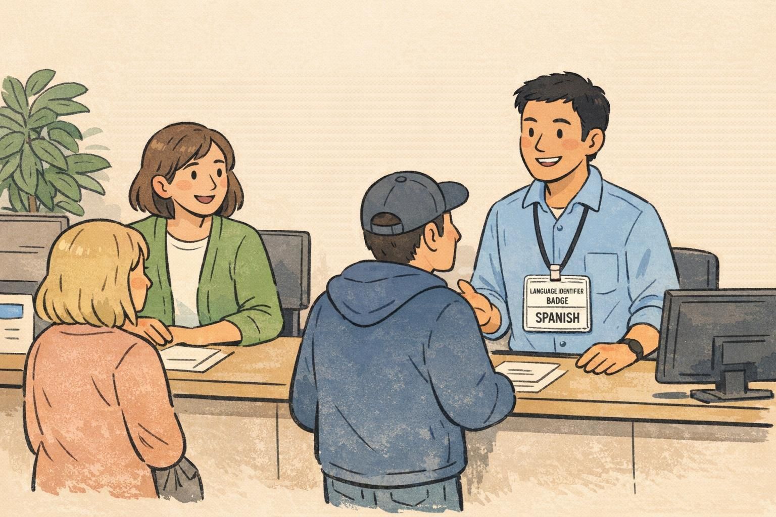
Why a language identifier badge reduces confusion in multilingual service In a busy workplace, communication is often the difference between “handled” and “hea...

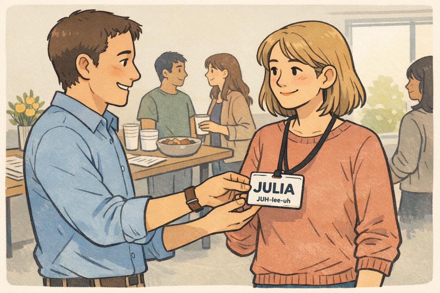
Why a First Impressions Name Tag Changes the Conversation A first impressions name tag does something surprisingly powerful: it removes the “what do I call you...